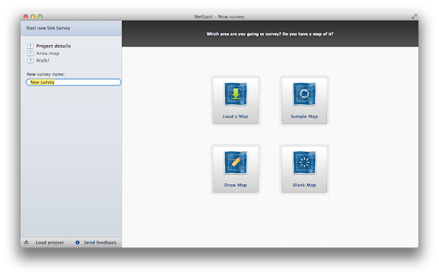
It goes without saying that you must have a portable Mac with working WiFi to map your network. After you download the app start it up and you will be asked to create a new survey and either draw or load a map.
 The drawing tools included in NetSpot are great but you can also use use a drawing program like iDraw or Intaglio to create your map. If you are a paper and pencil sort, you can also draw a map by hand, take a photo of it using your iPhone or iPad and import the file using the "Load a Map" function.
After you have the map loaded you will be asked to select two points and give the correct dimension between the two points.
Now you just need to start scanning. Click the "Start Scan" button in the upper left of the map, click your current location on the map and NetSpot will start scanning.
A list of available networks will appear in the panel on the left and a green circle will show the location you just scanned. Now walk to a new location and click that point on the map. A new scan will start. Continue on until your whole area has been scanned.
If you are using version 2.0 you can use the Discover mode and just see the network information you have gathered. This is an improvement over version 1 and gives you a quick look at the raw numbers.
To see a graphic representation of the numbers you need to switch back to the Survey mode. Use the"Visualize" drop down menu and choose from various options. Below is the graph of Signal-to-interference ratio.
The closer to the hot end of the spectrum you are the better your WiFi performance will be. You will also see where NetSpot thinks each of your routers is located. In my case I noticed that they seemed misplaced. Using the "Resume Scan" button I added more points on my map and got a better representation of their actual location. I have 3 routers on 2 floors. I have circled them in red.
If you are using version 2 then you get a pop up explaining what the definition is for each Visualization selection.
"The signal-to-interference ratio is similar to the signal-to-noise ratio, but in this case the interference is specific to co-channel interference from other radio transmitters."
In plain English that could mean that you have a problem if your network channel is on the same frequency as your neighbor. If so you might want to change it. As you can see, by using the different plots you can easily figure out where dead zones might be, if you need a bridge repeater or if you have too many routers in one area.
In general NetSpot does a great job of giving you a visual picture of your network. Getting the location of wireless equipment right always means a little trial and error and having a tool like this can really help perfect your configuration.
There is a paid for Pro version available with more features but for home use NetSpot is a great product.


This comment has been removed by a blog administrator.
ReplyDelete